Would anyone be interested in making a Logo and/or Title screen for Night Games?
Based on the responses to the previous post, I was looking into what I need to create a Patreon. It occurred to me that I don’t really have any image to represent Night Games. The game has been around long enough that I can’t really justify not having a proper title screen. I’ll throw something together in GIMP, but given my lack of artistic ability, I don’t have much faith in the result.
I can’t really afford to pay anyone at the moment, otherwise I might commission a graphic designer directly. People have been asking how they can help support the game and this is something that would really help me.
If you’d like to submit something, you can email it to thesilverbard@gmail.com. You can also leave suggestions in the comments.
Edit:
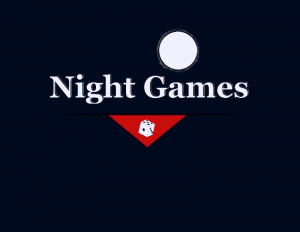
So here’s what I whipped up in GIMP in probably way longer than it should have taken.
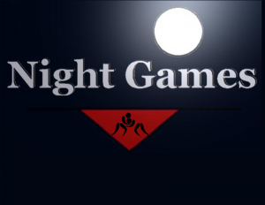
The color palate is based on the new GUI changes from InvalidCharacter (which will be in the next update). Here’s an alternate version based on some suggestions by dndw:
I also made a logo for the site. I did some scaling, which makes it look a little rougher. I may clean that up later.
Any thoughts? Do you guys like them or dislike them? I’m sure someone with a better eye for graphic design can do better, so if you want to send in a submission, I’ll take a look.


They’re basic, but they get the job done and they’re not hard to look at. I’m not a graphic designer, but it meets my approval.
I like the simplicity of them, the only change I would make would be to use more of the space with the first one
I love the logo for the site, but the game logo definitely could use some work.
I am not a graphic designer by any stretch of the imagination, but I’ll give it my best go.
The site/personal logo seems just fine to me. Perhaps either don’t let the sword touch the edge, or have the quill do so too. But that’s a minor detail.
Something about the game logo irks me. One thing is that there is a lot of empty space. I cropped it to a ‘bounding box’, so to speak, and that looks a lot better already. The red is a bit glaring. I replaced it with the color used by InvalidCharacter (#A40802), which is a bit darker and matches the background better I think.
The die also seems wrong. I get the symbolism; “Moon”=”Night”, “Die”=”Games”. But the game that the protagonist plays (the in-world game) is not the type of game played with dice or cards, but more “games” in the sense of gladiatorial games. Though less violent. I can’t draw worth shit, but perhaps stylized male and female figures in a fighting stance, him with an erect dick and her reaching for it? If you don’t want anything explicit in the logo, perhaps have the same two figures in a wrestling stance? Something like this one:
http://thumb7.shutterstock.com/display_pic_with_logo/724561/161785931/stock-vector-greek-roman-wrestling-active-young-women-sport-silhouettes-vector-abstract-background-illustration-161785931.jpg
My last point of criticism would be the glow around the moon, which just doesn’t look right.
This is what I came up with: http://i.imgur.com/GDhThag.jpg?1
There are some artifacts (I know a graphics word!) around the text, but I figure those are the result of compressing it to a png.
I really like what you did with the moonlight, it adds a lot more depth to the image. That wrestling silhouette is great. Shame it’s on Shutterstock. I couldn’t find anything nearly as good from any free sources, so I went with something more stylized. I posted the updated image above.
Before you say anything, yes, I do need that empty space at the bottom so I can fit buttons.
I am thinking similar to this that I wiped up in paint, http://imgur.com/QofiP2W , only less amateur.
Invert the triangle to face up, have the wrestlers standing on the bottom of the triangle, moon above them. And and no letters, the graphic should be simple and say what the letters say for you. Two wrestlers under the moonlight is enough really.
Ah, I’m a dummy you are making a title screen not a logo, disregard my previous comment about improving the image as a logo, since it isn’t for a logo comment N/A.